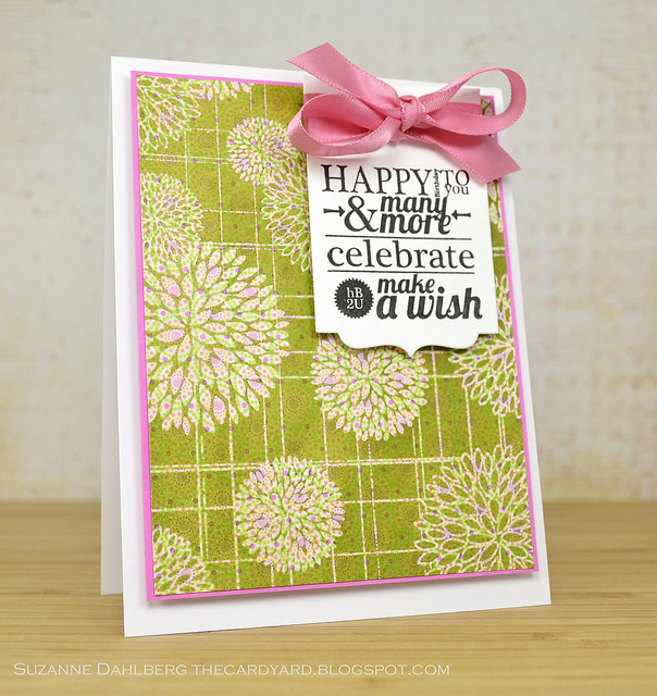
Day 2 of Pattern Play really took me out of my comfort zone, but the technique that Jennifer McGuire shared with us was too awesome to go untried. I did my best to find a good background stamp for emboss resist on patterned paper, and this great Flower Bursts image from Hero Arts was the one with the most open and filled space.
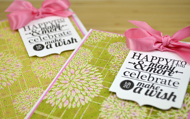
I used patterned paper from Doodlebug Designs’ Sugar and Spice line (ETA: Thanks, Bobby, for suggesting I show the original pattern. You can view it in 12×12 form here.) and a Framed Fonts sentiment from Avery Elle, as well as some Distress Inks - don’t see those much around here, either! Below you can see how I made this card twice using lighter and darker shades of Distress Ink:
You may also notice that the shine from the clear embossing powder is gone, and that’s because I also used Jennifer’s ironing technique to remove it - GENIUS!
Anyway, I think I prefer the darker green color since it makes the patterned paper stand out more, but these matching cards will come in super handy this weekend for my twin sisters’ birthday! Even into their 30s, I feel like I need to give them the same thing. 
So what do you think? Not bad for my first try, and now I think I need a whole new suite of background stamps for this technique! And with all the green going on here, I am entering this in the elegant emerald challenge over at Moxie Fab…
Suzanne
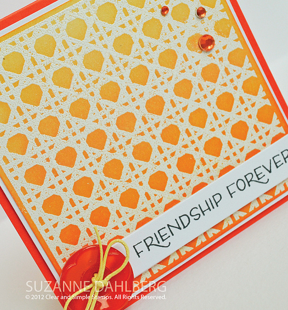
This is Part 2 of my Clear and Simple Stamps release post for today! Here, I am giving a brief tutorial on how I used distress inks to achieve the sunset effect in the card above. For all of my Seaside Summer projects, please scroll down. Thanks!
I should start by telling you that I am by no means an expert on Distress Inks, and that you can find tons of fabulous tutorials online. As a newbie, though, I thought it would be great to share my thoughts on this technique.
When I heard we were going to be featuring beach stamps as part of this release, I was reminded of many of the fantastic sunset and ocean cards that I’ve seen online over the years. I rushed to my LSS to invest in some Distress Inks and sponge applicators.
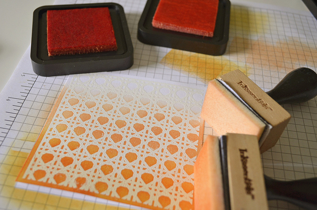
To start the project, though, you will want to stamp the background image in Versamark onto cardstock and coat it with white embossing powder. I find that using an embossing buddy on your cardstock before doing this helps to avoid stray particles of embossing powder from sticking to your cardstock.
Here is a photo of the image just before getting ready to apply the inks. Notice that I am doing all of this on my paper grid pad. I should tell you that there is a great reusable mat available for this technique if you prefer not to ink up your paper so much.
I chose two inks in two different but similar shades and am using two different sponge applicators. You will alternate between the two quite a bit, so having two on hand will just make the project move faster.
After inking up your sponge, which you will need to do many many times, you don’t want to immediately take the sponge to your paper because it will leave too much concentration of ink in one spot. Therefore, you should sponge off to the side before starting to rub the color into your embossed image.
You can see here how I’ve started with the darker color toward the bottom of the card, and I worked my way to the top with the lighter color, blending the two colors together toward the middle. You use a very light and circular motion as you apply the ink - it’s very relaxing and therapeutic!
After finishing your inking, you can wipe away the ink from the top of the heated embossing powder, and then fill in any gaps in the embossing with a white Signo gel pen. A very crucial trick!
And that’s pretty much it, at least in my mind. Hopefully this gets you interested in the technique, and encourages you to learn more from Distressers with much more experience! Their work is quite stunning!