This is my second post for the day.
If you’re here for the Ugliest Card Ever Blog Hop,
please scroll down or click here. Thanks!
Yippee for another Lil’ Inker Designs release! Today is Day 1 of a 3-day release hop, and if you’re hopping along with the team then you may have arrived here from Sarah Jay’s blog. And if you’re lost along this hop, you can always head on over to the Lil’ Inker Designs blog to start at the beginning.
Today we are featuring projects made with the new Mom and Dad dies and coordinating sentiment stamps, all of which are available in the store today.
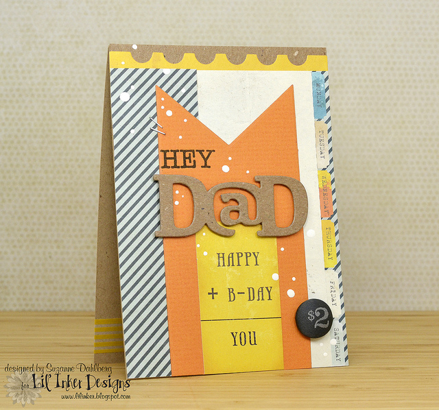
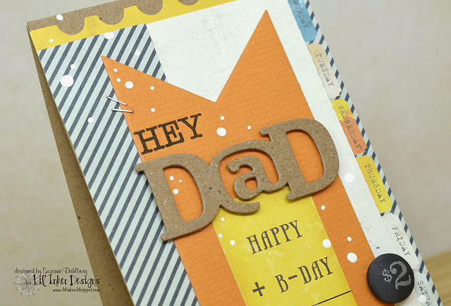
For my first card, I used the Dad die and the “Hey” sentiment to make a manly birthday card for my father-in-law. I used patterned paper from Glitz Design’s Uncharted Waters on both of my cards today, but I paired it with the birthday equation card and brad from Crate Paper on my Dad card:
I added the white splatter using some acrylic paint and then some tiny staples to make it seem more manly.
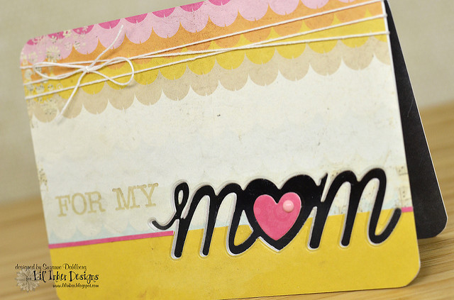
For my second card, I used the Mom die to make a window card:
I adhered the matching red heart to the acetate window, and stamped the sentiment in Hero Arts ink:
I also added an enamel dot from My Minds Eye and some crochet thread to the top to finish it off.
I hope you keep on hopping because there are two Lil’ Inker Designs $10 credits available as prizes to folks who comment along the way.Your next stop on the hop is the Lil’ Inker Designs blog!
Thanks for stopping by!
Suzanne
The theme for this month’s blog hop challenge at Papertrey Ink is “Boys to Men,” meaning that we should focus on masculine themes, colors, etc. I made a card for my dad, who is just the best guy on earth for too many reasons. Here’s a photo of him from my wedding day:
And here is my card for him:
I remember a card that Carly Robertson made once with Star Prints, and I think that she used a top note die as her layer; that was the inspiration for using the Nestie die as my own layer, but a smaller one so you can see the “headline” of the newsprint.
The woodgrain and newsprint backgrounds were both stamped in Versamark, and then I stamped over the woodgrain with the splat image in terracotta tile, trying to angle the splats in the direction of the star that’s mounted on the bottle cap, which I stuck to the paper by layering several layers of foam top on top of one another.
Can I just say how HARD it was for me to not add ANY ribbon to this project? VERY! 
Happy Blog Hoppin’!
Supplies {by PTI unless otherwise noted}: Stamps: Star Prints, Background Basics: Newprint, Background Basics: Woodgrain, Splat (Recollections); Paper: Terracotta Tile, Kraft, Rustic Cream; Ink: Versamark, Terracotta Tile, Dark Chocolate; Other: Star punch, double-ended banner die, Nesties die, bottle cap