A little while ago Amy and Jen were thinking of buying some pigment inks, and they asked me to stamp out come colors for them. I have most of the A Muse Studio colors and several Fresh Ink colors, so I put together this chart for them. Since it has been a few days since I posted (my blog host went down!), I thought I would share the comparison here.
On each of the four panels, the Fresh Ink is stamped on the left, and the similar A Muse Studio color from my stash is stamped on the right. Here’s a list of the colors on each card, by column. (A Muse colors noted with a “*” in the photo are called by their original name, and have had a name change since I purchased my inks.) I will say that Turquoise is much more of a genuine turquoise color than it appears in this photo, and Birch/Seattle appear more brown in the photo than they are in real life - so sorry about that.
Panel #1
Left: (Fresh Ink) Red Currant, Strawberry, Tomato Red, Fuschia, Pink Lemonade
Right: (A Muse Studio) Cherry, Burano* (now called Poppy), Apple, Berry, Grapefruit
Panel #2
Left: (Fresh Ink) Peach, Melon, Ginger, Mango
Right: (A Muse Studio) Bellini* (now called Melon), Apricot, Lido* (now called Saffron), Papaya, Mermaid
Panel #3
Left: (Fresh Ink) Freesia, Turquoise, Navy, Mojito, Basil
Right: (A Muse Studio) Blueberry, Ocean, Navy, Grass, Fern
Panel #4
Left: (Fresh Ink) Birch, Provincial Gray, Putty, Blue Sage
Right: (A Muse Studio) Seattle, Slate, Pebble, Latte
Which colors are my favorites? Of those shown here: Tomato Red, Berry, Melon, Mango, Turquoise, Mojito, Seattle and Provincial Gray.
Hope this was helpful! For dye inks, I have mostly been using Hero Arts inks, and my go-to black ink is Versafine Onyx Black, though the Memento Luxe one is very good too (both of those are pigment inks). My go-to brown ink is Papertrey’s Dark Chocolate (dye) ink - love!
If you have any questions, please let me know and I will reply in the comments here. Today’s highlight: I rescued a very very floofy white dog today - you can see his pic on my Instagram feed - it made my day!
Suzanne
I finished Summer Card Camp with a much shorter wishlist than I expected (*phew!*), but these Puffy Star dies from Lawn Fawn were quickly added to my list after seeing such CUTE cards made by Kristina Werner, complete with her signature white stitching. C’mon!? Who can resist these? I couldn’t wait to use them along with some Lawn Fawn papers and sentiment, which was stamped onto a Simon Says banner diecut.
In other news this week: this press release…I don’t usually “talk shop” here on my blog, but this is a first for me and kinda cool. Hope you’re having a great week!
Suzanne
This weekend I’ve been embracing my inner minimalist and feeling simple. I am not sure why this happens, but it’s often accompanied by my cleaning the house like a madwoman - the kind of cleaning where I empty drawers and cabinets (which is actually a good thing!), then sit back and wonder how I managed to obtain so much junk in the first place.
I’ve also been “simplifying” my craft room, realizing that I can make things that I’m happy with using roughly a quarter of the stuff that I’ve accumulated over the years, and tonight I felt like making a simple card to go along with my simple mood. This is about as simple as it gets for me: white cardstock, a die, scored lines, and glitter!
Anyway, the highlight of my weekend was eating an almond croissant from Helmut’s Strudel, an Austrian bakery in Rockport, MA. It was the best thing I’ve eaten in a while! Hope your weekend was great too…
Suzanne
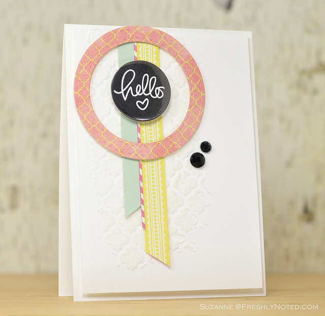
The August Card Kit from Simon Says Stamp has a fun Moroccan tile stencil in it, so I bought some embossing paste to try with it, and here is the result when combined with some of the patterned paper and the flair from the same kit. Hopefully you can see it in the photo. I am impressed that my first try was not a total disaster! I’m also surprised that the finish on this once it dries is not shiny or smooth - it has a very nice, somewhat rough texture.
I think you can add color to the paste in a variety of ways, so I am going to have to explore that! Either way, this is one heck of a fun kit!
Suzanne
This is my last post for Summer Card Camp 2 - these 3 weeks went by so fast! I was really inspired by Debby Hughes’ vintage card the other day, so I CASE’d her flower technique using one of this week’s sketches; I did my best to get as close to this week’s color combo as I could using the patterned papers in my stash.
I have been saving those felt leaves for so long - I tore them off another flower and added them to this one, but both pieces are from Prima. The sentiment is from Hero Arts’ Year Round Sentiments collection, and I used Antique Linen Distress Ink around the edges of the cream cardstock.
It has been such a busy week, so I’m really looking forward to the weekend!
Suzanne
A friend came over tonight for dinner and the plan was to craft a little but we accomplished nothing, so I made this card really quick after she left. I used my Simon Says July Card Kit and was inspired by this week’s sketch at Retro Sketches. Things just go so quickly when I am not making a mess with my stamps!
I worked at home today because I woke up to some absolutely crazy storms that ended up lasting all day (I am somewhat scared to get on the highway when it’s pouring rain like that) - we are okay, but some streets are reported to be under 3 feet of water tonight! The last time it rained like this, I remember seeing some people canoeing down the street…
XO,
Suzanne
Hey, friends! I’m over on the Neat and Tangled blog today with a CAS card that was inspired by something that I saw on Pinterest. Check it out!
I played around with these Mayberry papers and stamps today - the colors are so fun, and with all of the hot weather, it just seemed like a good time to embrace the humidity. Maybe it’s working because I heard it’s supposed to cool down this week! The hexagon comes from Hero Arts and was stamped in Winter Sky ink from A Muse.
And in case you’re interested, I updated my For Sale page with some more items today.
Sooo not ready for Monday…
Suzanne
 Hello!! I am sharing some happy news that a card that I made was featured in Northridge Publishing’s newsletter today - thanks to everyone for their sweet emails! The magazine has gone digital and has a new format, and it’s still my favorite to read. This card that was mailed back to me today - it was published in the March issue of CARDS magazine, and it was made using Crate Paper’s Lil Bo Peep line:
It’s no secret that this is my favorite paper company. Have you seen Crate’s sneak peeks this week? I don’t know about you, but Christmas papers that have pink in them make me smile - check these out! How about you? Do you have a favorite paper company? Any other peeks that I should see? I’d love to know!
XO,
Suzanne
Here’s my latest creation for Summer Card Camp 2! Today’s challenge was to create a card using this week’s color scheme and holiday stamps on a non-holiday card. As if my craft room wasn’t a mess enough…I pulled out my Christmas Box O’ Joy (where I stash all my holiday crafty supplies) and got going. I posted on Facebook the other day that I really hope there’s a video on the last day to teach us how to clean our crafty messes really fast!
For my card, I used two different holiday sets from Hero Arts: their Snow Dots background stamp and the tree stamps and dies from Holiday Cheer. I paired these with that fun sentiment from Kristina Werner’s Happy Every Day set. The oval and chevron dies are from Papertrey Ink, and the brown rhinestones are from Hero Arts.
I hope that you have a fun weekend ahead of you!
Suzanne
